
SDF Bricklumen Ofee
A fee/pricing section pairing an intro block with a bulleted list of what the management fee covers.
sdf-bricklumen-ofee.vue
Build
Follow along
The platform
Platform · The suiteOne workspace for components, portals and tools.See the platform See pricingComponents, Tools, Pricing and Docs are in the bar — nothing is duplicated here.
165 components with props, variants and clean classes. Audits that grade any URL for SEO, accessibility, speed and security. A branded portal for every client. Built by a working team, for working teams.
Library / Vue
One .vue file per component, generated from the canonical HTML and CSS so the markup and class names are identical to every other surface. 176 components, 930KB in total.
A fee/pricing section pairing an intro block with a bulleted list of what the management fee covers.
sdf-bricklumen-ofee.vue
An asymmetric bento grid: a lead feature tile on a dark surface, surrounded by smaller light cards and a wide summary tile. Use it to present a set of related capabilities with visual hierarchy.
sdf-bento.vue
Closing call-to-action band ('Let's talk about your property.') with 'Get in touch' and 'Meet the team' buttons.
sdf-bricklumen-act.vue
A small uppercase status pill with hairline border, four color tones, and an optional status dot.
sdf-badge.vue
Values section with an H2 heading and four H3 titled cards outlining core principles.
sdf-bricklumen-avl.vue
Two-column contact section pairing an info panel of contact-detail blocks with an HTML form (with success and error states).
sdf-bricklumen-cbd.vue
A dark, full-bleed opening hero built on a layered ground of soft colour washes and a hairline grid that fades out toward the bottom. Use it at the very top of a product or platform homepage when the page needs to open with atmosphere rather than a screenshot.
sdf-hero-aurora.vue
A tabbed panel switcher built entirely in CSS — hidden radio inputs, <label> tabs, and sibling :checked rules reveal one panel at a time. No JavaScript, no dependencies.
sdf-tabs.vue
Opening hero band with the page's H1 title introducing the About page.
sdf-bricklumen-ahero.vue
A restrained, overflow-safe breadcrumb trail with slash or chevron separators and the last item marked as the current page.
sdf-breadcrumb.vue
Four-up metric strip showing headline numbers like 480+ homes, 20 yrs, 98% retention and 4.9/5 rating.
sdf-bricklumen-ast.vue
The core team-member grid section that lays out individual people cards in a responsive grid.
sdf-bricklumen-tgrid.vue
Three-column pricing grid of tier cards presenting the plan options and prices.
sdf-foliotype-price.vue
Editorial blog masthead splitting a featured essay beside a ruled list of recent posts.
sdf-blog-hero.vue
Closing call-to-action band prompting the visitor to convert.
sdf-bricklumen-cta.vue
A thin, full-width announcement bar on a dark gradient: a glass badge, a line of text, and a trailing link. Sits at the very top of a page.
sdf-banner.vue
Feature section highlighting key product or service capabilities.
sdf-bricklumen-feat.vue
A labeled, accessible contact form with name, email, optional company, and message fields that flips to a thank-you state on submit.
sdf-contact-form.vue
A centred, precision-engineering page hero that sits on an off-white ground ruled with a faint blueprint grid, framed by four corner ticks, and closed by a full-width spec strip of four measured values. Use it at the top of a product, platform or documentation page where the story is accuracy, tolerance and evidence rather than momentum.
sdf-hero-blueprint.vue
Blog landing hero with an eyebrow label, h1 title, and lede paragraph introducing the blog.
sdf-bricklumen-bhero.vue
Site-wide footer, already a registered Webflow component instance repeated across pages.
sdf-bricklumen-footer.vue
Metrics band presenting headline numbers and proof-point statistics.
sdf-bricklumen-stats.vue
Team section with an eyebrow/H2 header and a four-cell grid of team member cards.
sdf-foliotype-team.vue
The core pricing tier comparison table listing plans, prices, and features.
sdf-northwind-pricing-table.vue
Narrative company-story section anchored by an H2 title with supporting body copy.
sdf-bricklumen-asy.vue
Closing call-to-action band with a heading, supporting paragraph, and action buttons.
sdf-bricklumen-octa.vue
A button or link element with primary, secondary, and ghost variants, three sizes, and an optional trailing arrow icon.
sdf-button.vue
A headed section laying out the owner services offering as a grid of cards.
sdf-bricklumen-osv.vue
Two-column contact hero pairing info and methods with a sticky message form card.
sdf-contact-hero.vue
A two-column hero with the copy on the left and a product console drawn entirely in markup on the right, tilted slightly and bleeding off the right edge so it reads as a live screen. Use it at the top of a product page when the fastest way to explain the product is to show its interface.
sdf-hero-console.vue
Contact page intro band with an eyebrow, an h1 title, and a lede paragraph inviting the visitor to get in touch.
sdf-bricklumen-chero.vue
Site-wide top navigation bar, already a registered Webflow component instance repeated across pages.
sdf-bricklumen-nav-pro.vue
A customer-stories section: one dark, glowing featured story with a pull-quote and headline stats, followed by a grid of six compact metric cards. Use it to turn social proof into a results-forward showcase.
sdf-cases.vue
A team member photo grid: portrait cards with a name and role, laid out three-up on desktop and collapsing to two-up then one-up on smaller screens. Use it for an "About" / "Team" / "Leadership" section.
sdf-members.vue
01
/ Platforms
Every Baselumen component ships as clean HTML + CSS, a Figma source, and a React reference — so design, dev, and prototyping stay in sync without translation work.
Live
Production-ready sections, navigations, and CMS templates. Copy a section ID, paste into the Designer, restyle as your own.
Q3 2026
A complete design system file. Variables for tokens, variants for states, auto-layout that matches the shipped class structure 1:1.
Q4 2026
Headless TypeScript components with proper accessibility primitives. Drop into Next, Astro, or Vite — the same DOM as the HTML build.
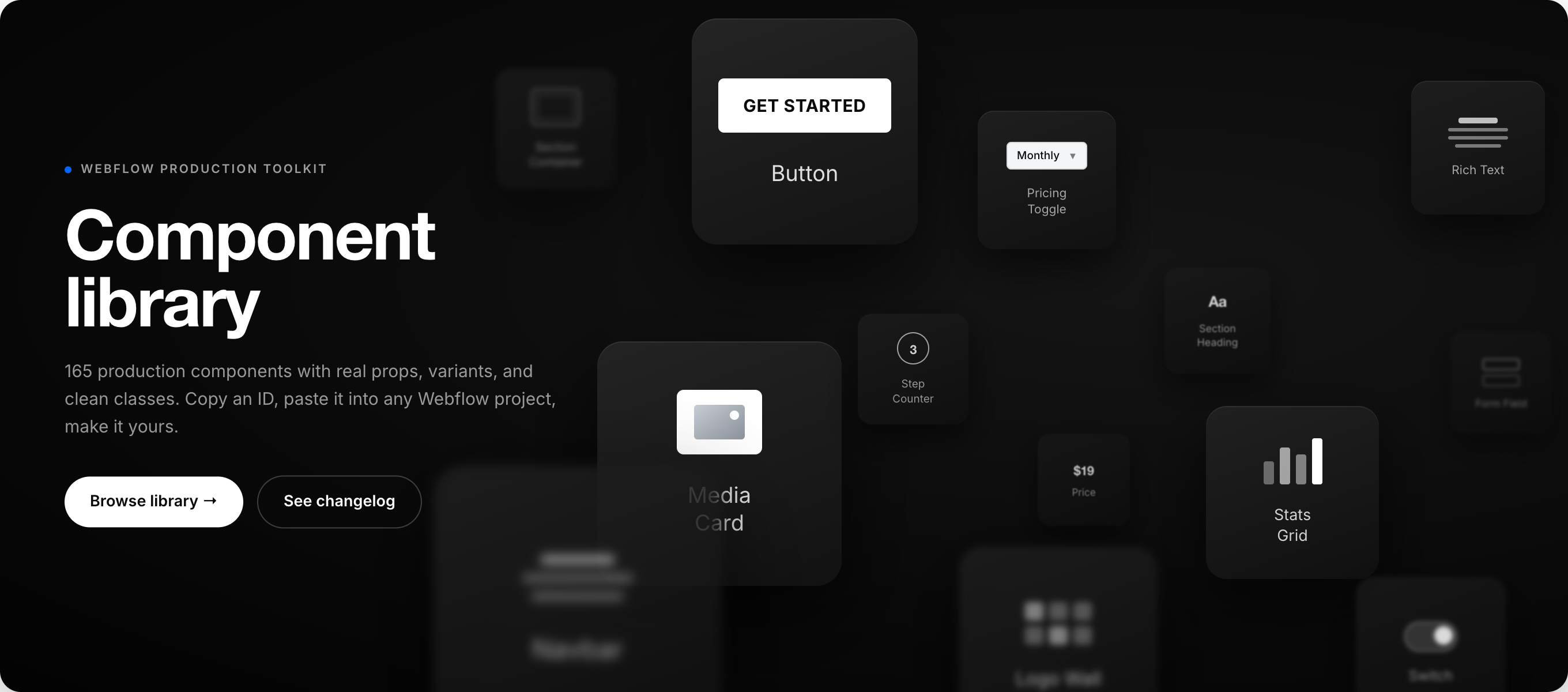
Real props, real variants, clean classes. Copy an ID in the app, drop it into any project, and it is yours to change.
02
/ Utilities
Daily-use utilities every web team quietly needs — built into the same surface as the components, so you stop hunting through bookmarks.
02.01
/ Reference
Live
Searchable reference for every data-* attribute the components use. Click to copy, paste into your build.
Open reference →
02.02
/ Generators
Beta
Color scales, type ramps, spacing grids, and shadow systems — output as CSS variables, utility class names, or Figma tokens.
Open tools →
02.03
/ Diagnostics
Beta
Drop in a published URL — get a report on missing alt text, heading order, classes, broken links, and CMS field gaps.
Run audit →
03
/ Principles
Baselumen is intentionally narrow. Rather than be everything for everyone, it tries to be very good at the handful of things below.
03.01 / Production-ready
Every component here is one we'd ship to a paying client — no placeholder copy, no broken responsive states, no half-finished interactions.
03.02 / Accessibility
Keyboard-tested, screen-reader-tested, and contrast-checked before anything gets a version number. Accessibility isn't a future release.
03.03 / Versioning
Components carry version numbers, changelogs, and migration notes. If a class name changes, you'll know — and know exactly how to update.
03.04 / No lock-in
Once a component is in your project, it's yours. No license keys, no embed scripts, no “powered by” badges. Restyle and rebrand freely.
03.05 / Tokenized
Every color, font, radius, and spacing step is a CSS custom property. Override at the root, a section, or a single instance — the cascade is the whole model.
03.06 / Agnostic
Framework-free HTML and CSS. Drop it into Terminal, Astro, Next, or a plain page — the markup doesn't care what surrounds it.
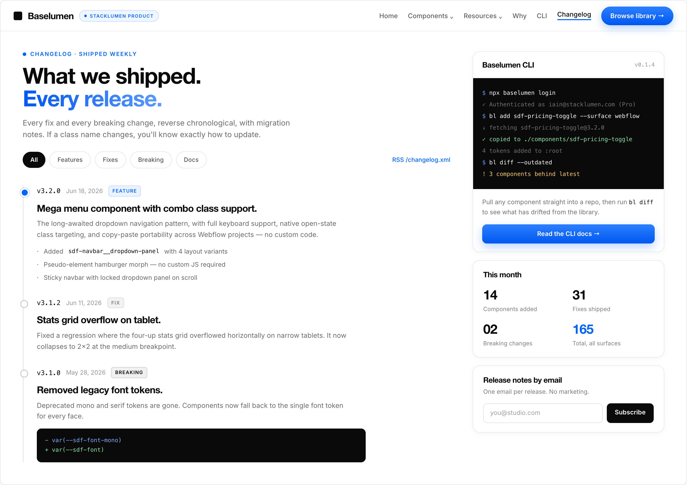
Reverse chronological, with migration notes. When a class name changes, you know exactly how to update.
05
/ Contact
Questions about the library, licensing, or a custom component? Send a note — we read every message and usually reply within a business day.
apps@stacklumen.com
Response time
Within 1 business day
Based in
Lexington, KY
Private, paid beta
No account required to browse. No newsletter signup, no sales calls, no email-gating the docs — just copy, paste, and ship.
